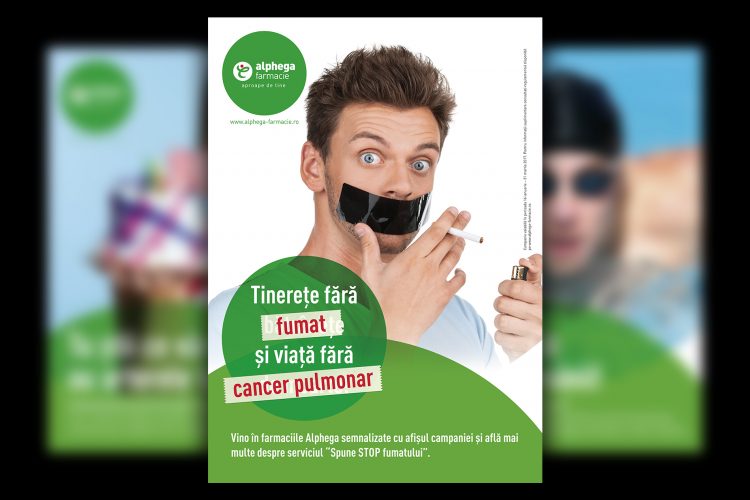
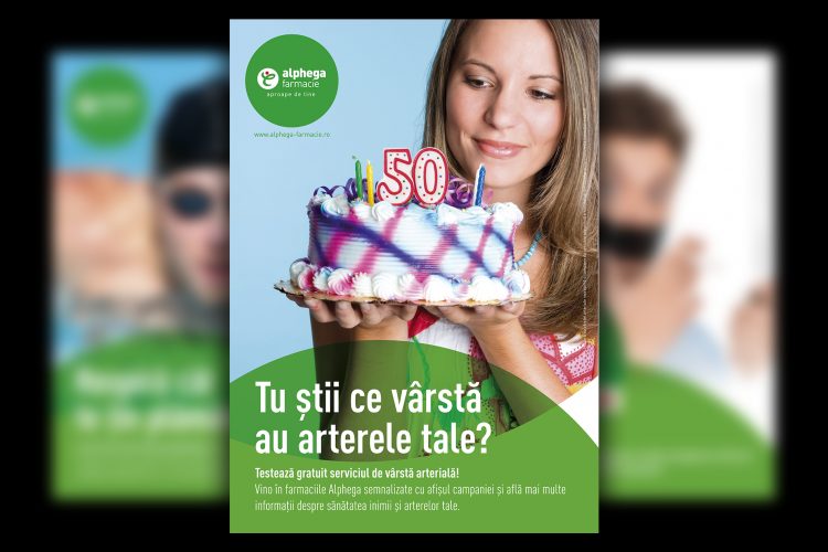
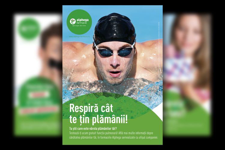
The request: National campaigns that will bring people to Alphega for free health check-ups
The idea: Suggestive imagery and clear, powerful messages
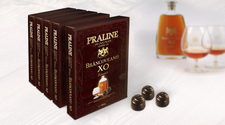
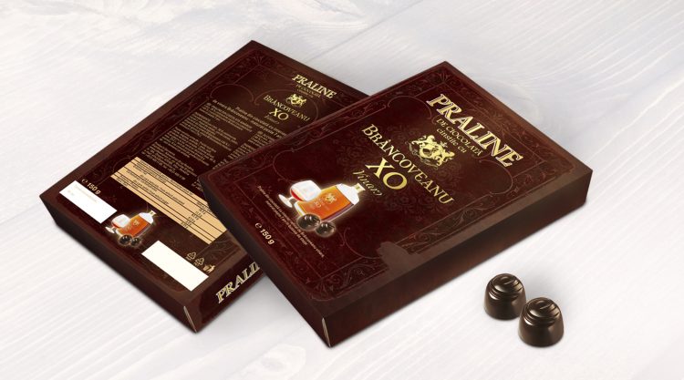
The request: Creating a visual identity for a new brand of chocolate pralines filled with Brancoveanu liquor
The idea: The box of chocolates looks just like a book, an invitation for everyone to discover its story about fine taste
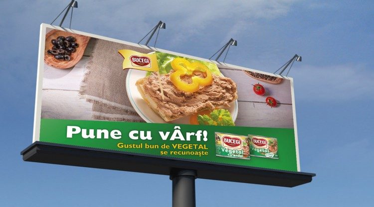
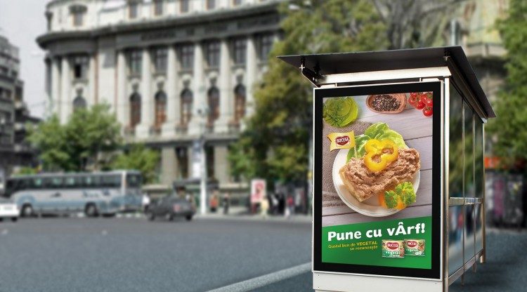
The request: To adapt the concept we proposed for the original Pate Bucegi in a way that fits the veggie version of the product.
The idea: “Pune cu varf!” proved once again how powerful it is, as this unforeseen adaptation came naturally.
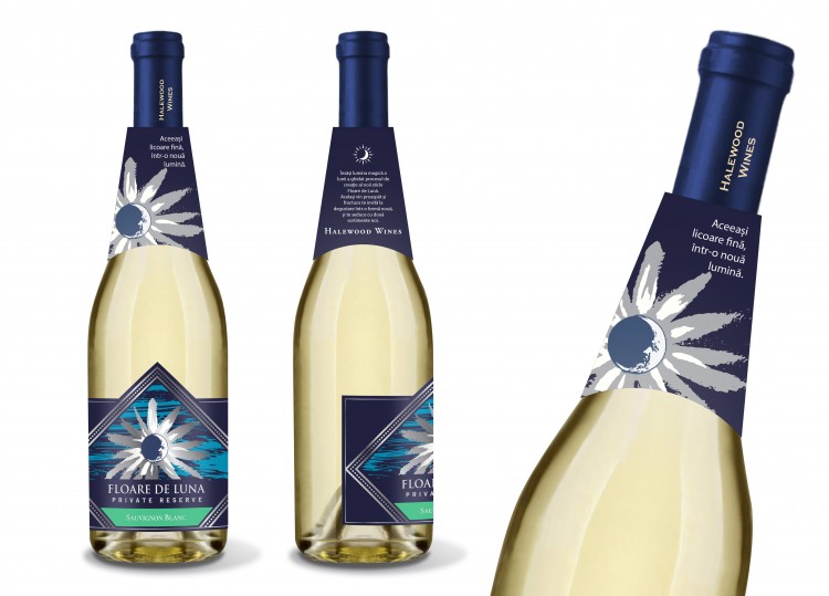
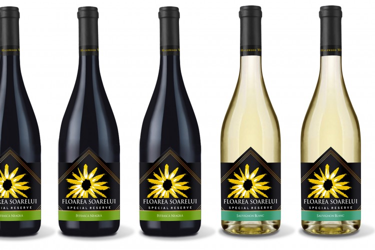
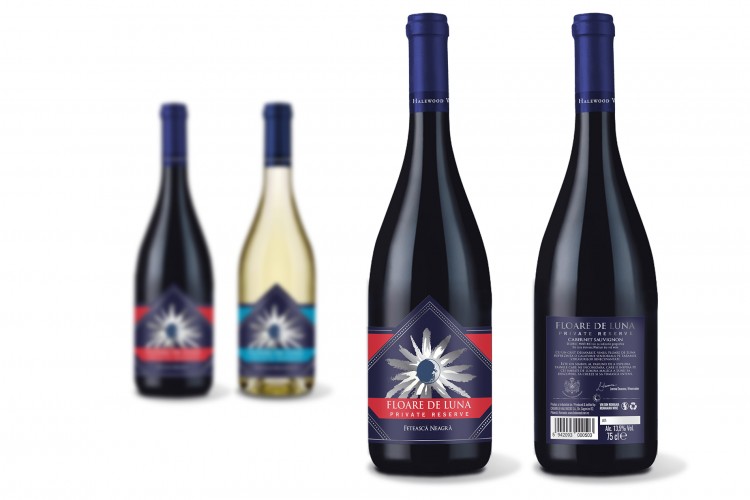
The request: refresh the visual identity of Halewood’s “Floare de Soare” and “Floare de Luna” wines.
The idea: we’ve updated the brand’s look, with a more appealing, clean and modern design.
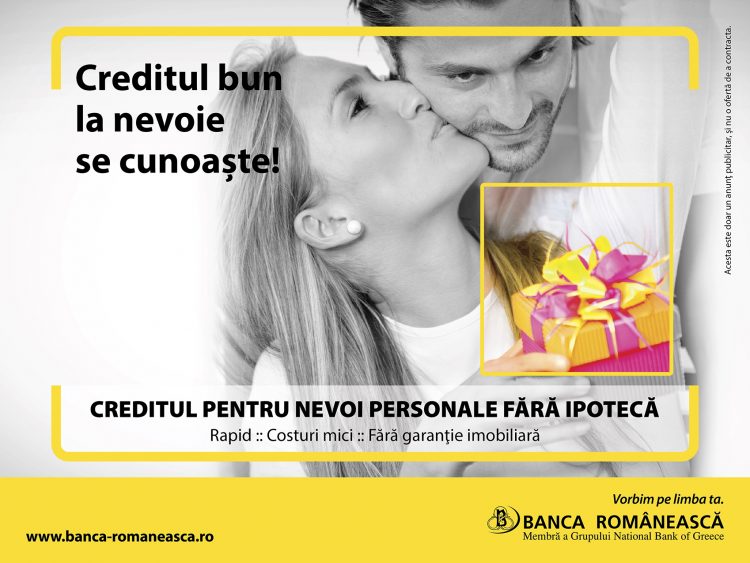
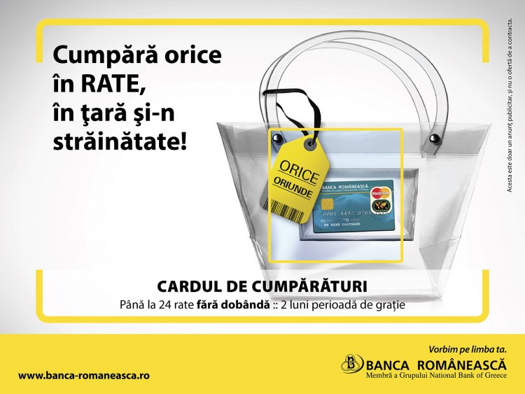
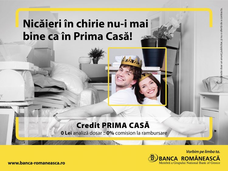
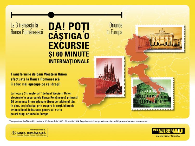
The request: A campaign that advertises banking products
The idea: The visual highlighted that collaborating with Banca Romaneasca lets you focus on what really matters, while a couple of popular Romanian sayings were transformed in order to communicate the products’ advantages
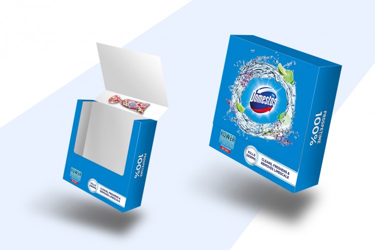
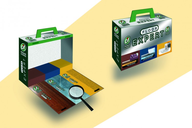
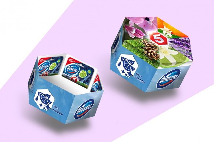
The request: Create special multi-packs packaging design for Domestos/Cif
The idea: We highlighted the products’ power to clean any type of surfaces

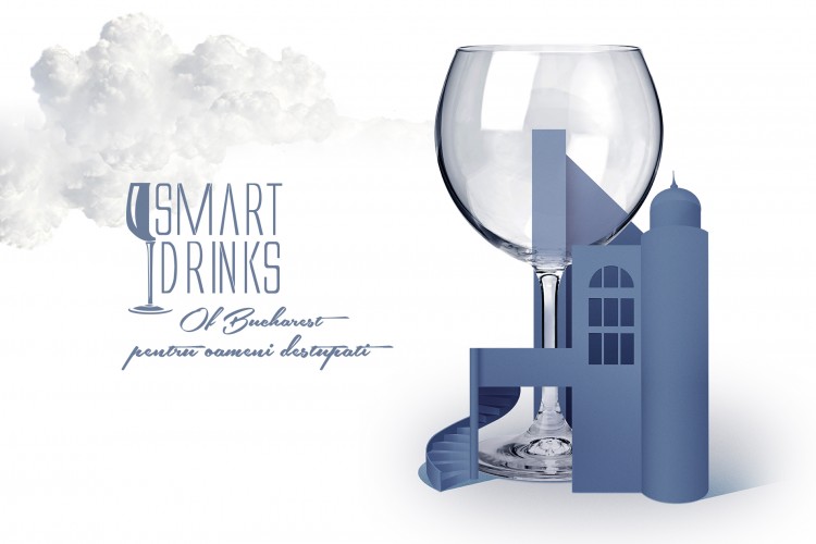
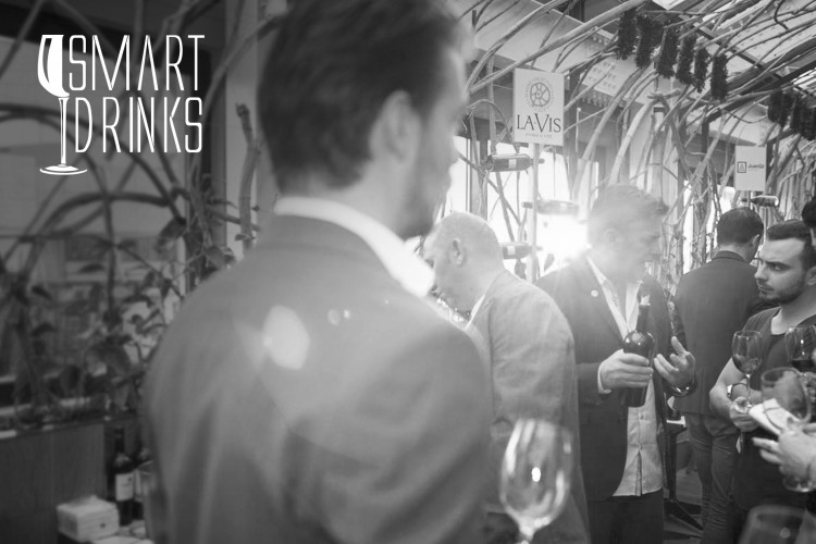
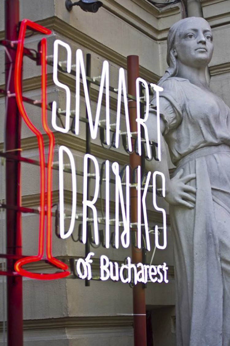
The request: the location for this classy tasting event changed, so they needed a new visual concept that would be in line with the concept we created for the first event.
The idea: the new place matches the “high-life” look & feel of Smart Drinks of Bucharest even better. The upgraded visual identity shows us that the event reaches new heights, while keeping the smart attitude.
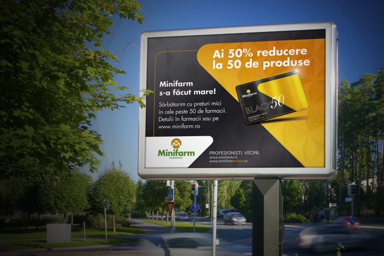
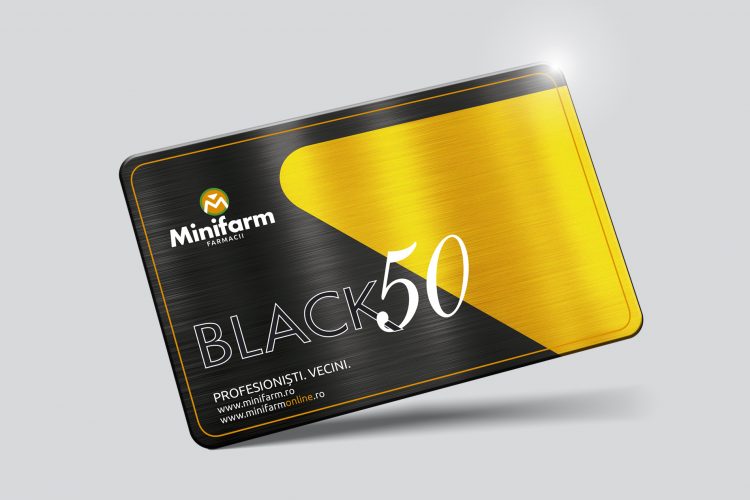
The request: A promotional campaign that celebrates the opening of the 50th Minifarm pharmacy, the largest chain in Dobrogea region
The idea: A celebratory design and a playful copy did the trick, attracting people in big numbers into Minifarm
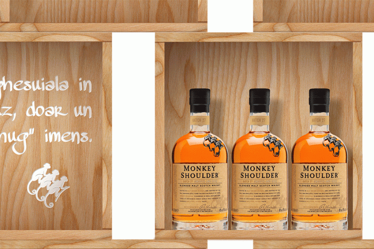
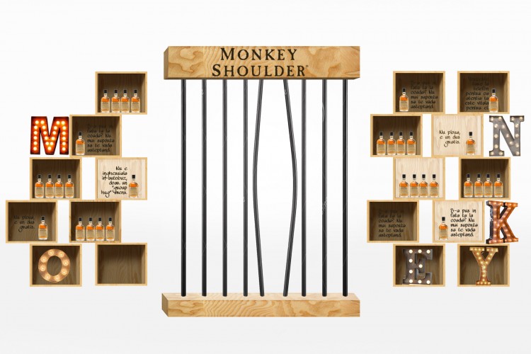
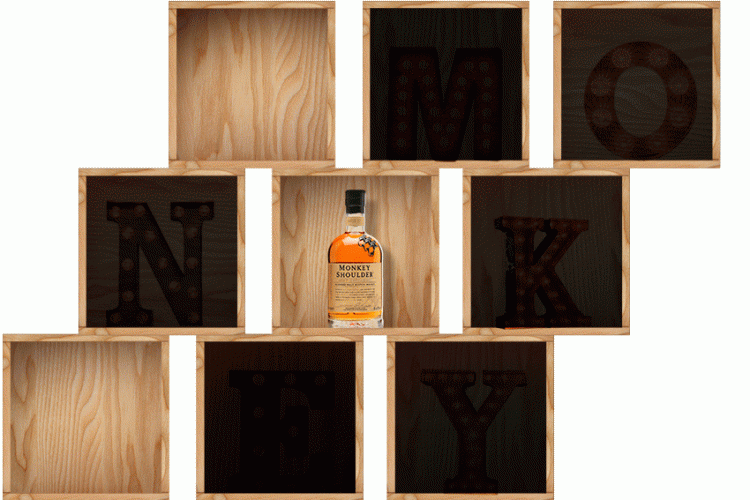
The request: create an visibility campaign for Monkey Shoulder’s first encounters with the Romanian public
The idea: “Urban Jungle Escape Guide”, where every modern-day “problem” has a solution… disguised as a cocktail. Our stand and activation went hand in hand, giving a real taste of the brand and making a great first impression.
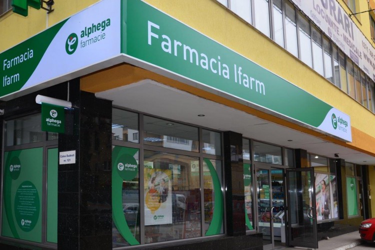
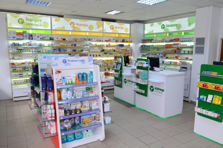
The request: implement the chain of independent pharmacies concept, according to the particularities of the Romanian market and adapted to the patients’ needs
The idea: we managed to reunite all the local independent pharmacy partners under the same brand umbrella. With a clear vision, we implemented Alphega’s desired brand identity to hundreds of branches, using a uniform communication style and a visual flow alike
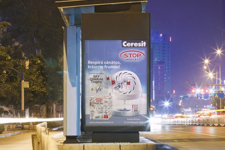
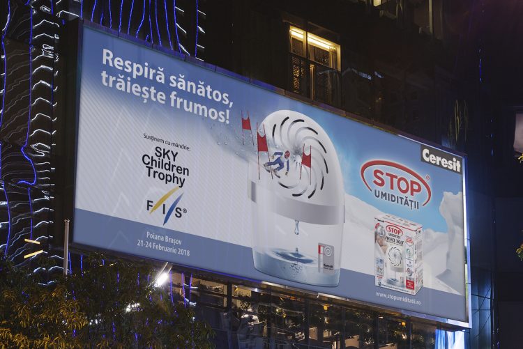
The request: Announce the fact that Ceresit’s air dehumidifier is sponsoring the biggest children ski competition
The idea: We transformed the product into a slope, and communicated in a friendly, inspirational manner.
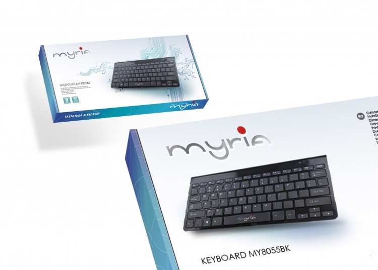
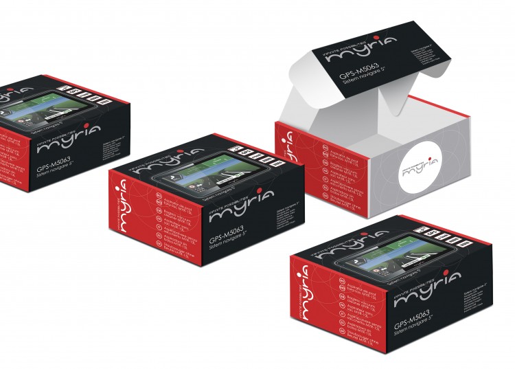
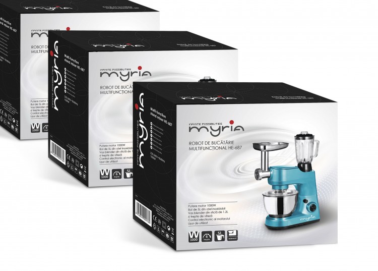
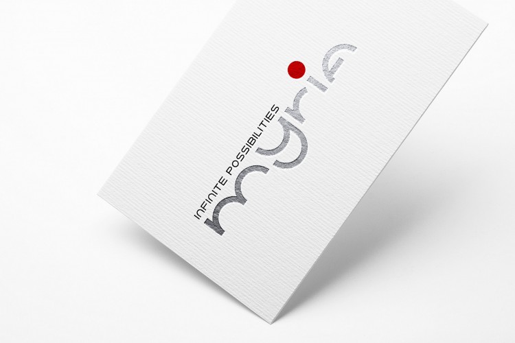
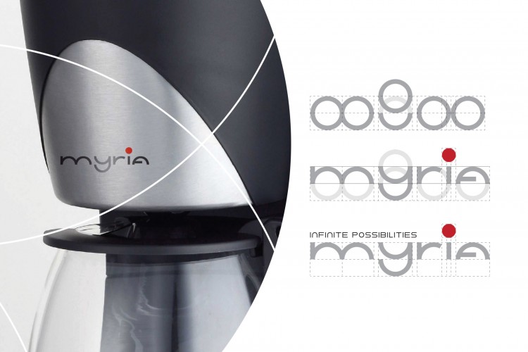
The request: a new brand identity
The idea: a simple push of the button opens up a world of infinite possibilities! We wanted to create a minimalistic and friendly logo, which, along with our new slogan – “Infinite Possibilities”, would transform Myria
into the trustworthy partner for anyone’s daily activities.
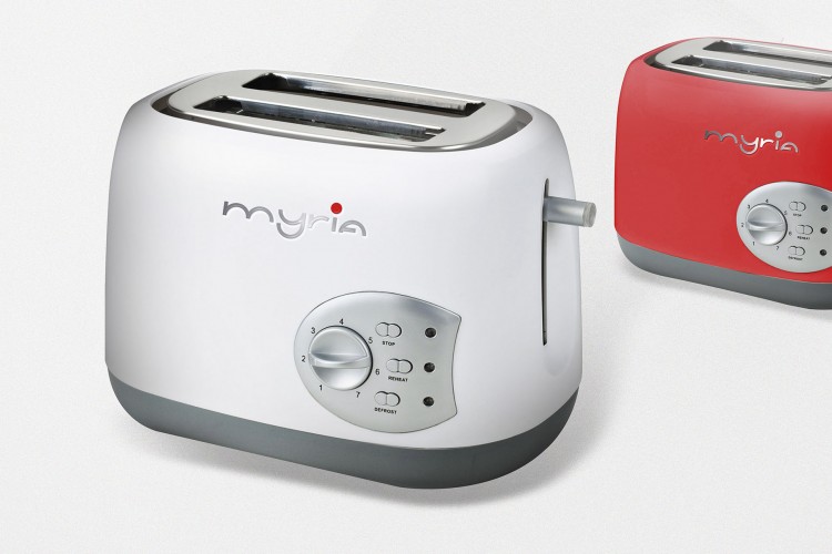
The request: a new line of packaging for the whole product range
The idea: a modern, colorful and lively packaging concept, that would attract the consumer and inspire him the simplicity and the pleasure of using Myria products
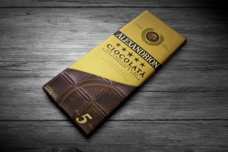
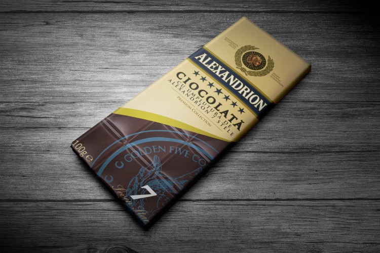
The request: Packaging for Alexandrion’s newly launched brandy-flavoured chocolate
The idea: Alexandrion is a fine, noble brandy. And the chocolate inspired from it is even more delightful, due to the unmistakable 5 and 7 year old brandy filling. Therefore, we gave it a real star “treatment”, designing an elegant and premium packaging, that honors its noble traits accordingly.
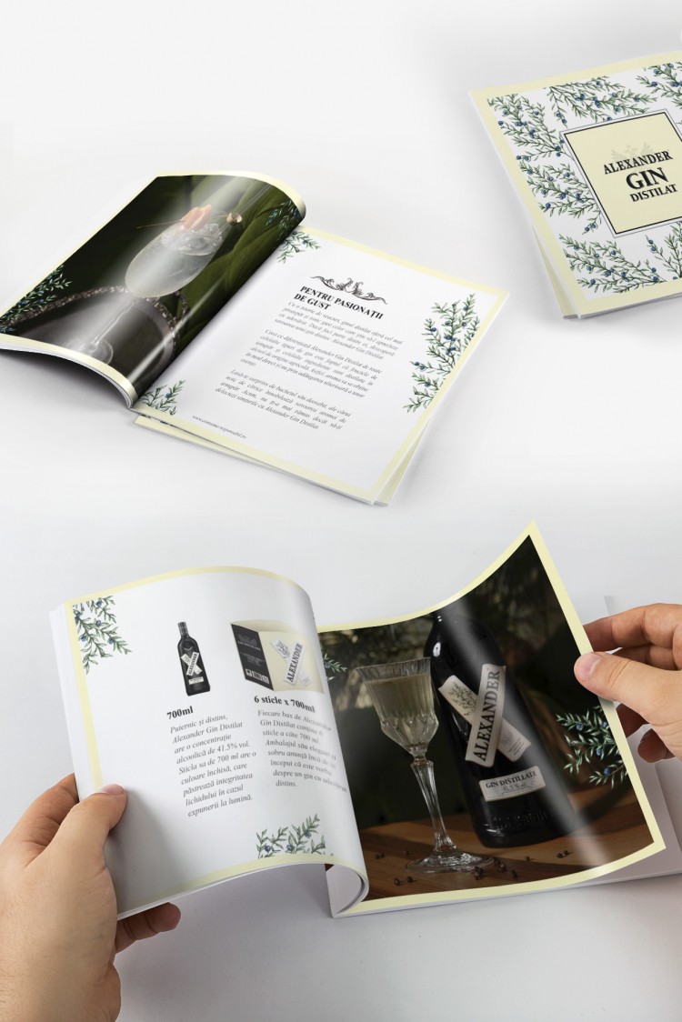
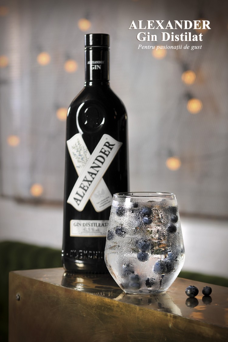
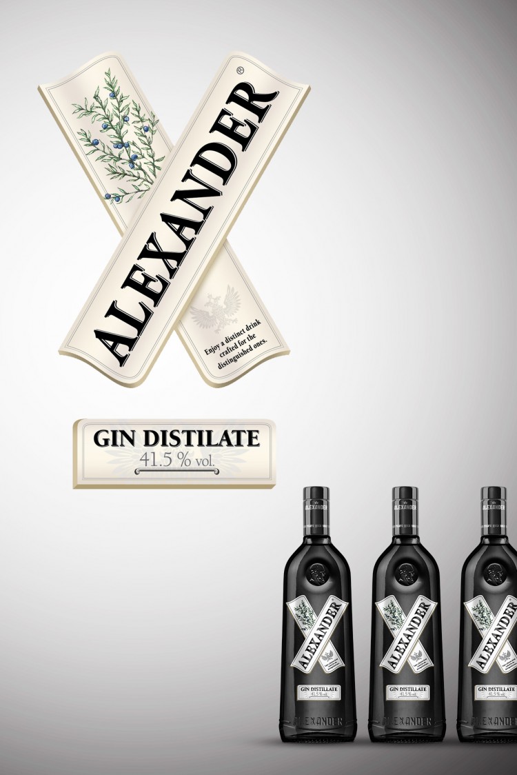
The request: branding identity for a new gin
The idea: we showed ingredients of the product and highlighted its quality, with elegant branding that would match an exquisite black bottle. We also developed several promoting materials, such as neck-rings, posters and brochures, all of them aiming to place the gin as a sophisticated, but accessible brand.
The request:
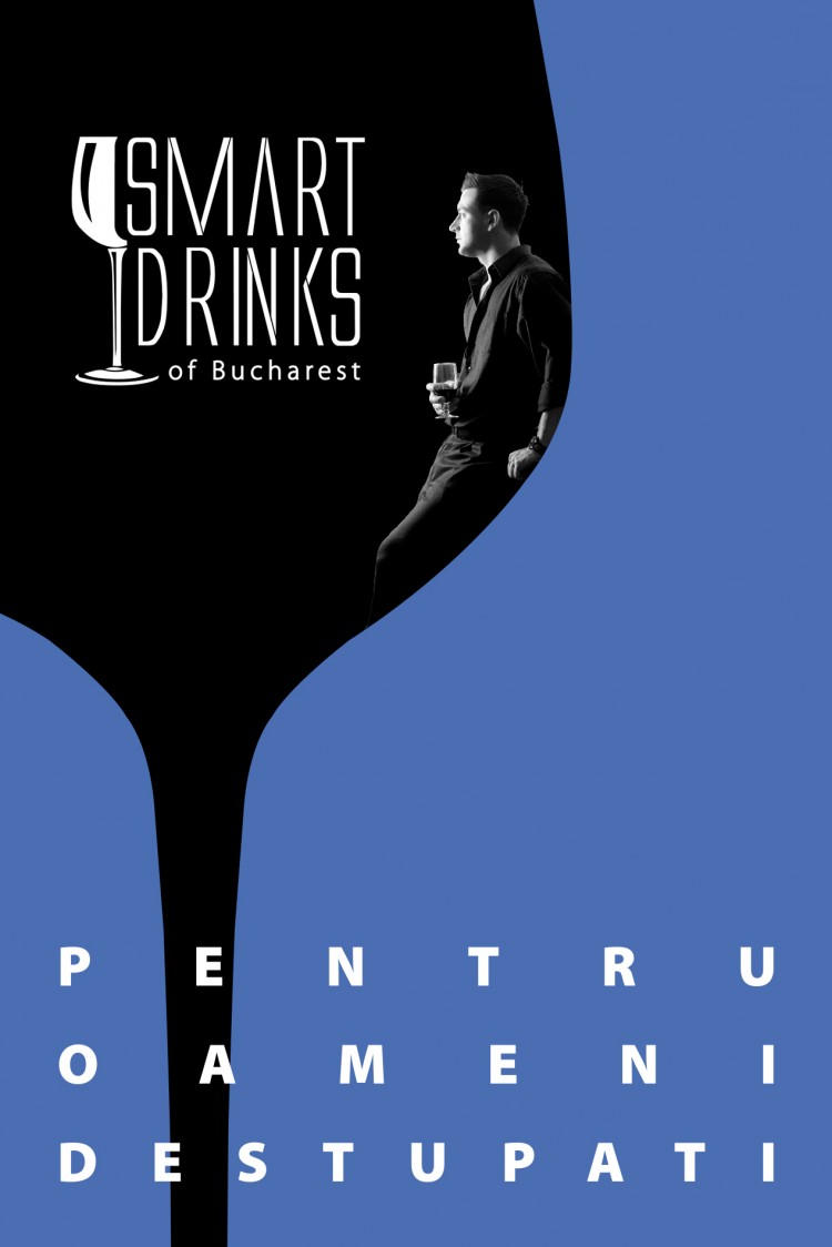
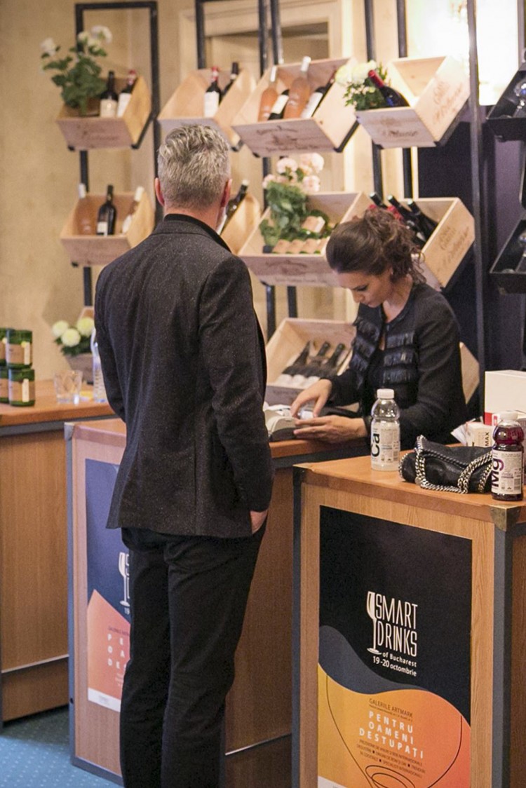
Branding identity for an annual social drinking event
The idea:
Smart Drink of Bucharest – the place where HoReCa owners or simply passionate people can taste fine drinks from all around the world and, of course, buy them. The design that match these high-standards and a smart, catchy slogan – “Pentru oameni destupati” – do the trick for each edition.